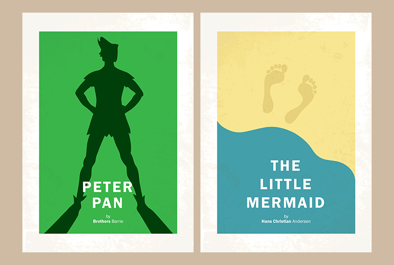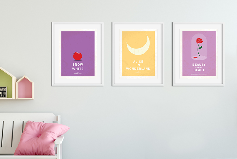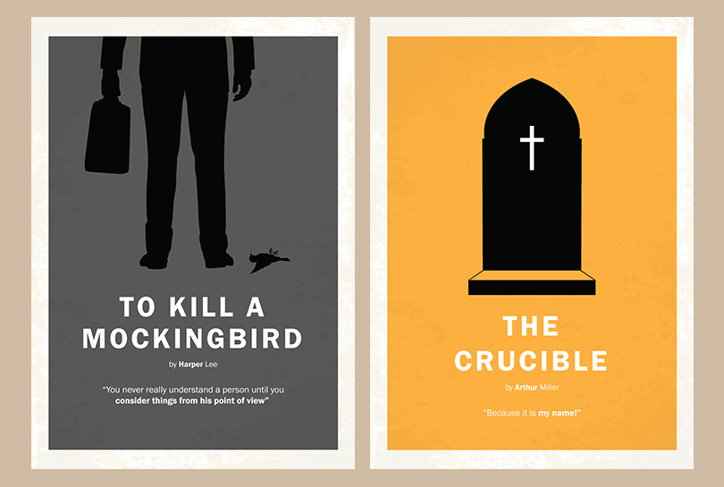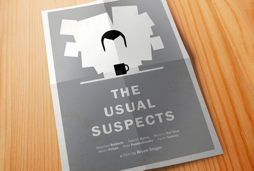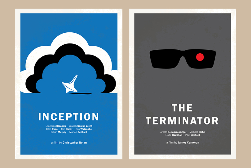


Through my experience in design, I've come to respect and appreciate simplicity - making every design, layout or stroke work to its fullest, removing superfluous 'stuff' that doesn't add value to the experience. The younger me would've loved to fill every pixel or millimetre with something' cool', 'trendy' or 'new'. However, I've come to find that these things mostly detract from the goal of the creative or design. My minimalist posters were a creative outlet to experiment with stripping back designs to their bare minimum while keeping them easily recognisable and intriguing.
The minimalist poster series started as some fun, creating alternative posters for cult film classics. However, my brother loved them so much that he wanted me to make another set of posters to display to his high school English class. From here, he selected the literature and helped me identify 'iconic' scenes, phrases or figures that would allow the viewer to recognise the story. From there, I would draw out the design and choose an appropriate colour for the backdrop, adding the author's name and a key quote from the book as a teaser.
