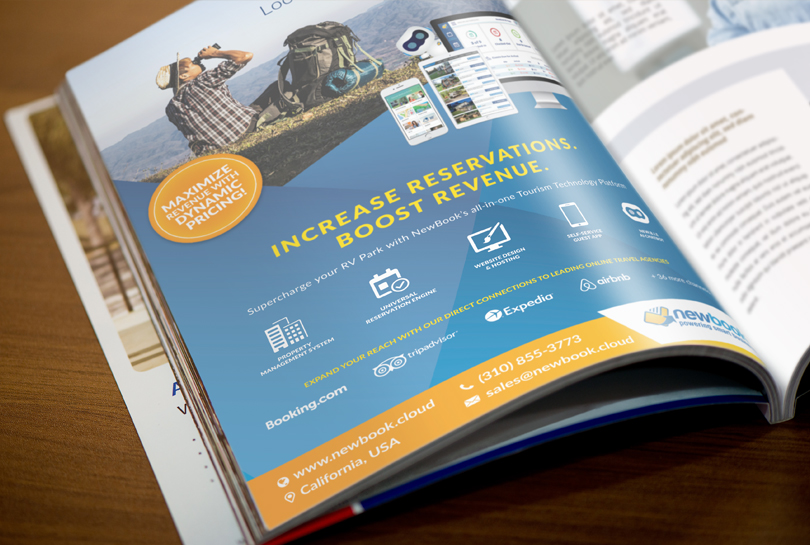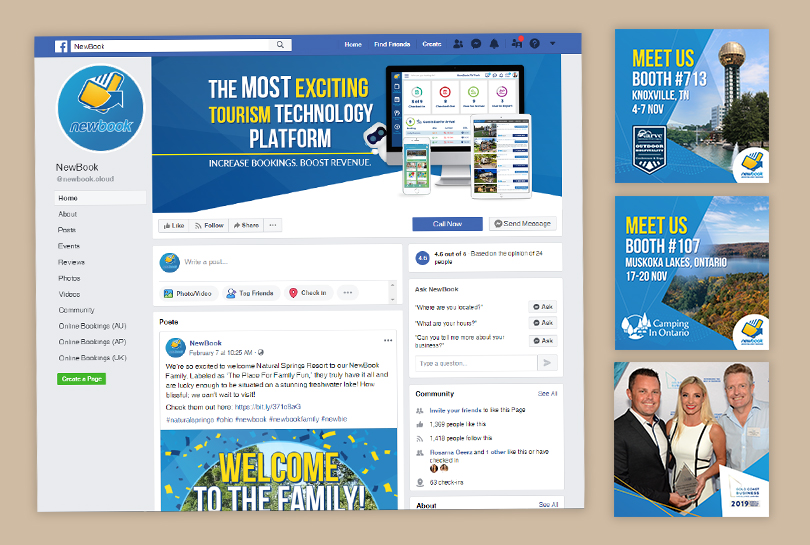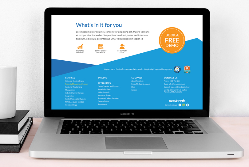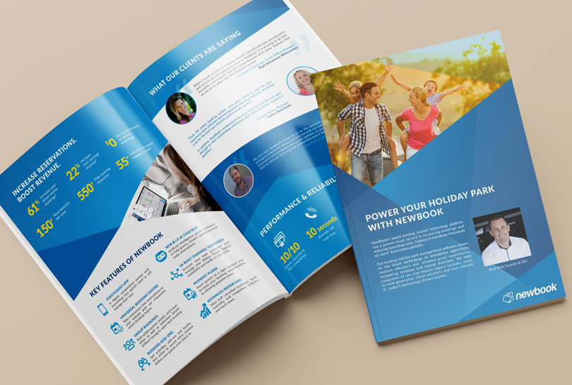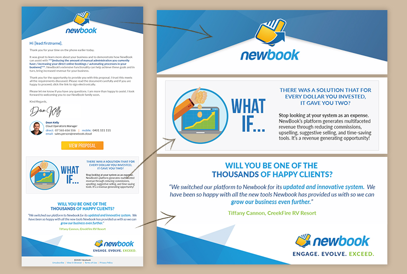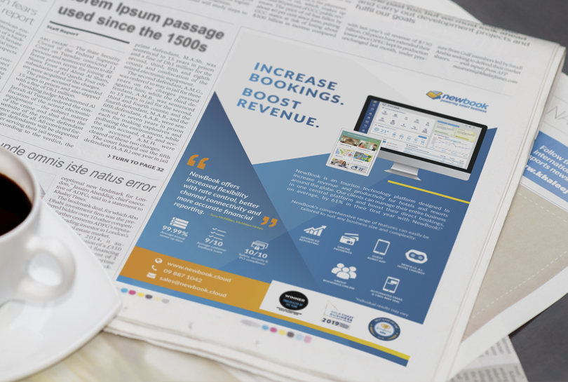


I was employed full-time as a digital designer within the marketing team whilst the previous designer was on medical leave. My day to day duties were varied and diverse. Animations and video for email headers, YouTube and social media posts were created utilising my skills in AfterEffects and Photoshop. Using Adobe InDesign and Illustrator, I was able to craft engaging print advertising, company collateral, signage and conference stands which were featured in magazines, expos and merchandising. I learned new skills in WordPress, helping edit and create pages for the NewBook website as well as proof-reading and copywriting.
Like many designers before me, I wanted to put my mark on the NewBook brand and catapult the old, outdated style into a more modern, forward-thinking identity. However, after conducting an extensive brand audit, I realised that the many designers before wanted to do the same. Almost every 18 months, the brand direction would pivot, and the graphic style, icons, colours, patterns and even the logo would change. The inconsistency in brand identity is damaging for brand image, recognition and brand equity.
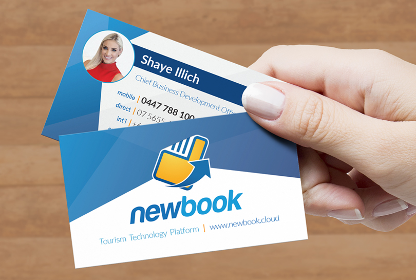
In conjunction with the Marketing Manager, we decided to take a cue from a previous design style and develop it to its fullest. The aim was to provide a solid and consistent visual language that projects clarity, unity and dynamism. I took a geometric pattern from one of the previous company letterheads to develop the concept further. I incorporated geometric patterns into business cards, a new website design, email signature, email marketing headers and all other collateral. Lighter and brighter shades of blue, within the style guidelines, were utilised to convey contemporary and youthfulness to the visual base.
Over the years, the company logo’s byline would change in a bid to capture key target markets. However, NewBook offers a diverse selection of products and services that no byline was relevant for an extended period. The byline also brought limitations for the use of the logo in small scale, especially when designing for mobile devices. Therefore the byline was scrapped, and the logo proportions were re-worked. These design decisions instantly helped modernise the logo and increase its usability and flexibility within the digital and printed landscapes.
Designs and concepts are the intellectual property of NewBook Pty Ltd and were completed under their employment.

