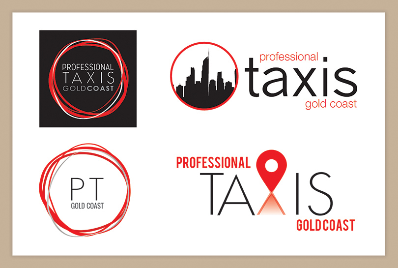

The PTGC team requested an update to their logo. They wanted to modernise their brand and regain market share taken by their competitors. The client brief was to keep the existing colour scheme but create a more modern and stylised identity. Keeping some current features enabled us to relate the past logo to its future.
Through the Logo development cycle, I experimented with a stylised form of the four wheels of a car and the Gold Coast skyline. I also experimented with location markers which symbolised the pickup and dropoff service taxis provide. The client chose to develop the ‘four wheels’ concept, which was then further refined.

