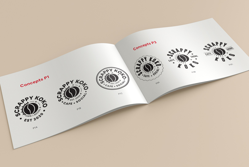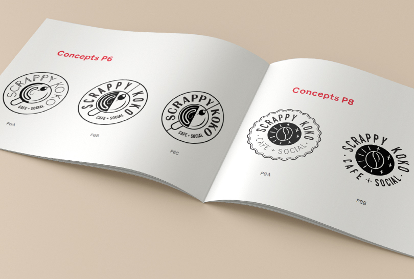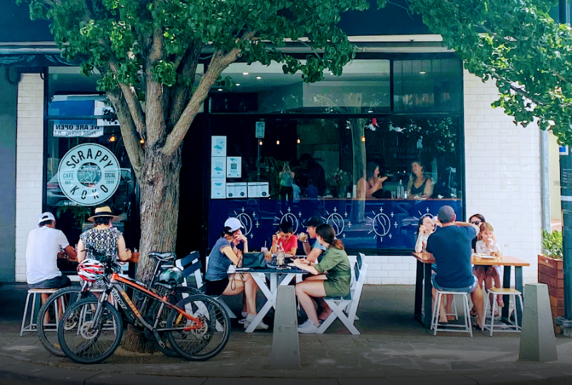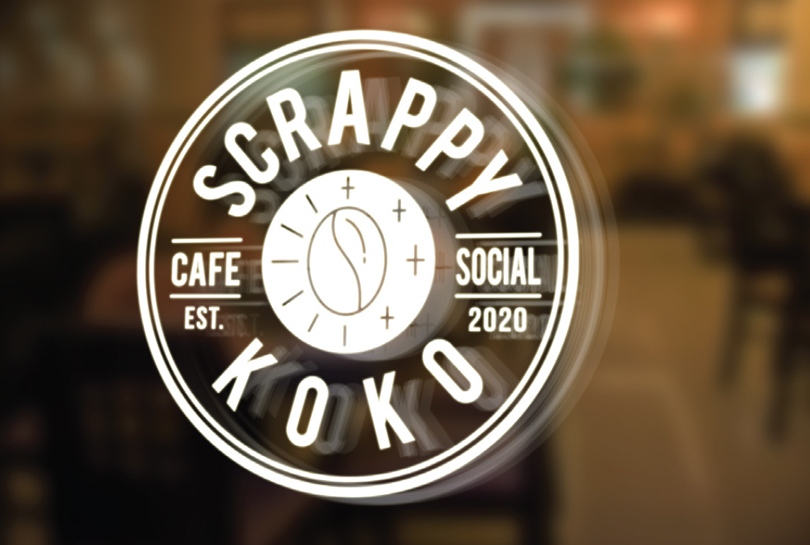


Williamstown in Melbourne has an exciting new dining venue, Scrappy Koko! The McLaughlin’s new café aims to serve its patrons from morning to night, breakfast to beers. But first, they needed a logo and brand identity. The Scrappy Koko logo needed to reflect the cafe’s duality of day and night. Another requirement was an emphasis on Scrappy Koko’s specialised coffee blend featuring in their drinks and cocktails. Scrappy Koko’s brand personality was trendy, hip and easy-going, with the logo needing to reflect these characteristics.
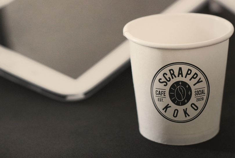
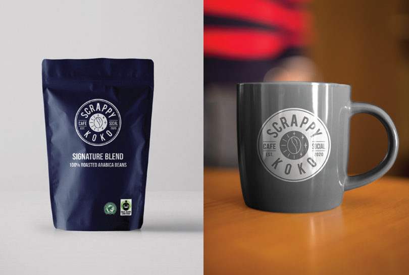
The final logo design was the development of the two-part coffee bean concept. One side of the coffee bean shows rays of sunlight – representing day. The shine on the right-hand side creates a crescent moon with stylised stars balancing the sun’s rays on the opposing side. The final outcome is a contemporary logo that heralds back to vintage emblem logo designs, something the McLaughlins were attracted to in the consultation phase.
